New Metropolitan Area Data from JOLTS Reveals Dynamic of Labor Market Before the Pandemic
BLS’s newly published one-time research estimates for the 18 largest metropolitan statistical areas (the Job Opening and Labor Turnover Survey or JOLTS) provides monthly data on job openings, hires, quits, layoffs and discharges, and other separations from a sample of approximately 16,000 establishments. JOLTS provides dynamic views behind the official unemployment rate. With JOLTS, data users can understand how much quit rates or layoffs and discharge rates account for the total separation rate. These metropolitan statistical areas (MSAs) represent some of the largest functional labor markets in the US. BLS has requested funding in 2021 to expand the data to include 50 MSAs in the future.
What can JOLTS tell us about the regional labor market?
The research estimates include the data between February 2001 and December 2019. Since the current national sample size is not designed to support estimates for major industries at the sub-state level, BLS produced model-assisted estimates at the regional level. If you are a data nerd who is interested in how they did it, BLS’s methodology further explains the details.
During the 2020 C2ER conference, Laura Thomas, Research & Analytics Specialist at Cedar Rapids Metro Economic Alliance, introduced how to use Google Data Studio for data visualization. By following her instructions as laid out in that conference session, C2ER was able to present recent BLS data on a JOLTS dashboard. On the left of the dashboard, there is a table that shows the 18 MSAs’ headcount (in thousands) for hires, job openings, total separations as well as hires-per-job-opening ratios. By default, the table shows the average count throughout all years. For each specific year, the table shows the monthly average for these statistics. The hires-per-job-opening (HPJO) ratio column is added to help data users’ understanding of the different region’s abilities to fill open jobs. The HPJO ratio can be a useful tool by providing a simple metric to evaluate which regions are filling their open jobs more efficient within its labor market.
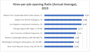
The HPJO ratio divides the number of hires that occurred during a month by the number of jobs that remained open at the end of the month, according to Charlotte Oslund, statistician in the Office of Employment and Unemployment Statistics, at BLS. For illustration, let’s take a look at Figure 1 for key metropolitan regions in 2019. In 2019, all 18 MSA regions had an HPJO ratio less than one, indicating fewer hires than end-of-month job openings. What does it mean? It could signal the region is less efficient in filling vacancies in the labor market. If the HPJO ratio is greater than 1.0, it indicates the region hired more employees than the remaining job openings, thus signaling a more flexible labor market.
On the right side of the dashboard, users can select their region of interest. Once you choose one of the 18 MSAs, the three scorecards summarize the average rate of hires, job openings, and total separations for that metropolitan area throughout the available years. Below those summary statistics, a line graph shows the time trend of these three statistics. One can clearly see that the hire rate and job opening rate dropped steeply during the Great Recession period.
BLS Term Definition
- The hires rate is computed by dividing the number of hires by employment and multiplying that quotient by 100.
- The job opening rate is computed by dividing the number of job openings by the sum of employment and job openings and multiplying that quotient by 100.
- The separation rate is computed by dividing the number of separations by employment and multiplying that quotient by 100.
Lastly, the bar graph shows details of the rate of total separations. BLS defines the separation level as “the total number of employment terminations occurring at any time during the reference month” and is reported by three types of separation: 1) quits, 2) layoffs and discharges, and 3) other separations, including retirement or death. On average, one can see the quit rate has been going up as US regions get out of the recession, probably with more options of voluntary separations for better career opportunities, childcare, moving or any other reasons. The dashboard helps labor market information staff see JOLTS data visually with easy access.
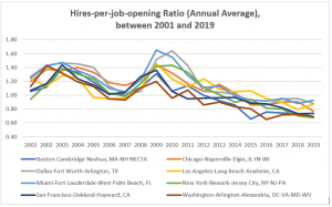
The JOLTS data also enables researchers to examine the hires-per-job-opening ratio over time, and it can show regional labor market trends. Figure 2 shows some key metropolitan area’s HPJO ratio between 2001 and 2019. This graph shows an increasing trend right after the Great Recession, indicating steep decrease in job openings. It also shows the steady and slow decreasing trend in the post Great Recession period, as job opening increased at a much greater pace than hires. Again, an important cutoff is 1.0 – ideally filling in most job openings with hires in that month. In recent years, the New York metropolitan area seems to experience fewer hires relative to its openings.
Figure 2
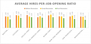
Following Oslund’s approach using the National Bureau of Economic Research (NBER) recession determination, this post compares the trend for the HPJO ratio over time for the eight MSAs. Figure 3 shows the average of HPJO ratio for before the Great Recession (December 2001- November 2007), during the Great Recession (December 2007- July 2009), and after Great Recession (August 2009 onward). The average ratio is much lower in the post Great Recession period, indicating job openings are occurring more actively than hires.
Figure 3
Matching people to open jobs is a top priority for most of the labor market information experts. The JOLTS MSAs research estimates ended in December 2019, and we do not know how US regions are faring in terms of job separation in 2020. Before the COVID era, though, the job opening, hires, and quits reached historic highs nationally since the series began in December 2000. The March and April 2020 JOLTS national data showed the highest number of job separation on record.
If the FY2021 budget is funded, the JOLTS program would expand its sample to support direct sample-based estimates for all states with more detailed questions. Current JOLTS for the 18 largest MSAs covers about 40% of all US employees. With the proposed expansion, data users are likely to see the top 50 MSAs JOLTS data with the sample-based approach. Further analysis of employment by industry in each metropolitan statistical area could significantly enhance training and re-skilling processes by connecting education/certification/license programs tailored to the region.
Resource
Technical Tutorial: 2020’s Data Visualization on a 1920’s Budget, C2ER/LMI Institute (Virtual) Annual (Virtual) Annual Conference, Jun 1st, 2020 @ 2:30 pm – 3:30 pm
Citation
US Bureau of Labor Statistics, Handbook of methods, chapter 18, “Job Openings and Labor Turnover Survey,”
Charlotte Oslund, “Which industries are filling job openings and which industries are not? Exploring the JOLTS hires-per-job-opening ratio,” Beyond the Numbers: Employment & Unemployment, vol. 7, no. 15 (US Bureau of Labor Statistics, October 2018), https://www.bls.gov/opub/btn/volume-7/which-industries-are-filling-job-openings-and-which-industries-are-not-exploring-the-jolts-hires-per-job-opening-ratio.htm


